

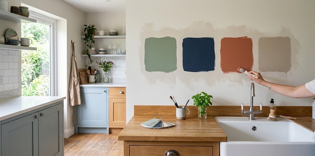
Kitchen paint color is one of the highest-impact, lowest-cost decisions you can make in your home, and also one of the easiest to get wrong. The right shade can make a cramped kitchen feel open and a dated one feel current, while the wrong choice can clash with cabinets and countertops you already love.
This guide walks through everything that actually shapes a good color decision, from your fixed materials to natural light to the finish you apply on top. If you’re planning a kitchen renovation from scratch, start with our full renovation guide and come back here once your cabinets and countertops are chosen. By the end, you will have a clear process instead of a stack of paint chips and no way to choose between them.
Start With Your Fixed Elements
Before flipping through paint fans, take stock of what you cannot easily change. Your cabinets, countertops, and flooring anchor every other decision, so the color needs to work with them rather than the other way around.
Reading Your Cabinet and Countertop Undertones
Every material carries an undertone, whether that is warm, cool, or neutral, and spotting it early prevents a lot of frustration later. Hold a plain white sheet of paper next to your countertop or cabinet sample, since the contrast makes subtle yellow, gray, or blue undertones much easier to see.
Wood cabinets often lean warm, while quartz and marble countertops can swing either way depending on their specific veining. Once you know which direction your fixed elements lean, choosing a wall color that complements rather than fights them becomes far more straightforward.
Accounting for Flooring and Backsplash
Flooring plays a bigger role in your color scheme than most people expect, since it sits in the same sightline as your walls and cabinets. Dark hardwood floors generally pair better with lighter wall colors to avoid a heavy, closed-in feeling.
Your backsplash tile or material should also factor into the decision, especially if it includes any pattern or color variation. Treating it as another fixed element, rather than an afterthought, keeps the whole room feeling intentional.
Consider Your Kitchen’s Natural Light
Light direction changes how a color actually reads on your walls, which makes it one of the most important factors in this whole decision. The same paint chip can look completely different depending on which way your windows face.
North-Facing vs. South-Facing Kitchens
North-facing kitchens receive cooler, flatter light throughout the day, which tends to mute colors and can make some shades look duller than expected. Warmer tones with a hint of yellow or peach undertone generally counteract this and keep the space feeling inviting rather than cold.
South-facing kitchens get warmer, more direct sunlight for most of the day, giving you more flexibility to experiment with cooler blues, greens, or even deeper shades without the room feeling flat. If you are unsure which direction your kitchen faces, a quick check with a compass app on your phone settles it in seconds.
Adjusting for Small or Windowless Kitchens
Smaller kitchens with limited natural light benefit from colors with a higher light reflectance value, since these bounce more available light around the room. Warm off-whites and soft neutrals tend to perform best here, especially paired with a glossier finish that reflects light rather than absorbing it.
If your kitchen has no natural light source at all, leaning slightly warmer than you initially planned usually keeps the space from feeling sterile under artificial lighting alone.
Popular Kitchen Paint Colors and What They Say
Once you understand your fixed elements and lighting, choosing from proven color families becomes much easier. Each direction below creates a distinctly different mood.
Warm Neutrals and Whites
Warm whites and soft greiges remain the most dependable choice for a reason, offering a clean, timeless backdrop that works with nearly any cabinet or countertop combination. They also tend to photograph well and appeal broadly if resale value matters to you.
These shades work particularly well in kitchens with limited light, since their higher reflectance helps brighten the space without feeling stark or clinical.
Greens, Blues, and Bolder Choices
Sage and muted green tones have become a favorite among designers for their calm, earthy feel that pairs beautifully with both wood and white cabinetry. Soft blues bring a similar sense of calm while leaning slightly cooler and more coastal.
For those wanting real personality, navy and deep charcoal create a dramatic, sophisticated look, particularly effective on lower cabinets or an island rather than covering every wall. Bolder colors work best when balanced against lighter surrounding surfaces so the room does not feel closed in.
How to Properly Test a Paint Color
Testing is where most people go wrong, and getting it right prevents an expensive, time-consuming redo down the line.
Common Testing Mistakes to Avoid
Painting a small swatch directly onto your existing wall color is one of the most common errors, since your current color skews how the new one reads. A tiny paint chip held up under store lighting also fails to represent how the color will actually behave in your kitchen.
Testing only once, at a single time of day, is another frequent misstep. A color that looks perfect at noon can shift dramatically under evening lighting.
The Right Way to Sample Colors
Paint a large panel, at least two feet by two feet, on primed board or poster paper rather than directly on the wall. Prop it next to your actual cabinets, countertop, and flooring rather than viewing it in isolation.
Check the panel in morning light, midday sun, and evening artificial lighting before making a final call. Giving the sample forty eight hours to fully cure also matters, since fresh paint often looks slightly different than its finished state.
Choosing the Right Paint Finish
Color and finish work together, and the wrong sheen can undercut even a perfect color choice. Kitchens deal with grease, steam, and constant cleaning, which makes durability a real consideration alongside appearance.
Eggshell and satin finishes strike a solid balance for walls, offering enough durability to wipe clean without an overly glossy look. Semi-gloss holds up best in high-moisture zones directly around sinks and stoves, and it remains the standard choice for cabinetry thanks to its wipeable, furniture-like finish.
Matte finishes look beautiful but show wear more easily in a busy kitchen, so they generally work better in lower-traffic areas of the room rather than high-use walls.
Painting for Personal Style vs. Resale Value
If you plan to stay in your home for years, choosing a color you genuinely love should outweigh concerns about broad appeal. A kitchen you enjoy spending time in every day is worth more than a marginally safer resale choice.
If a sale is on the horizon, warm neutrals and whites consistently perform best with buyers, since they photograph well and let people imagine their own style in the space. A reasonable middle ground is choosing a neutral for the walls and saving a bolder color for lower cabinets or an island, where it adds personality without dominating every buyer’s first impression.
How True Homely Helps You Choose the Right Kitchen Color
Settling on the right kitchen color involves more variables than most people expect, from undertones to lighting to finish, and having a clear resource to work through makes the process far less stressful. True Homely was created to help homeowners move through exactly this kind of decision with confidence.
Our home and living resources cover color pairing guidance, lighting considerations, and practical testing tips suited to real kitchens rather than showroom photos. Whether you are refreshing walls or planning a full repaint alongside a renovation, our content is built to help you land on a color you will still love years from now.
FAQs
What color should I paint my kitchen if I have white cabinets?
Soft greiges, warm off-whites, sage green, and muted blues all pair well with white cabinets, depending on whether you want a subtle or more distinct contrast.
What is the best paint finish for kitchen walls?
Eggshell or satin generally offers the best balance of durability and appearance for kitchen walls, while semi-gloss suits cabinetry and high-moisture areas near the sink and stove.
What color paint makes a kitchen look bigger?
Light, warm neutrals with a high light reflectance value bounce the most available light around the room, which helps a small kitchen feel more open.
Should kitchen walls match the cabinets?
Walls do not need to match cabinets exactly, and often look better when they complement rather than mirror them. A neutral wall paired with colorful cabinets, or the reverse, tends to create more visual depth than an exact match.
What is the most popular kitchen paint color?
Warm whites and soft greiges remain the most widely chosen kitchen colors, prized for their versatility and broad appeal, with sage green close behind as a popular alternative.
How do I test paint colors before committing?
Paint a large sample panel rather than a small chip, place it next to your actual cabinets and countertop, and observe it in morning, midday, and evening light before deciding.
What color kitchen sells a house faster?
Warm neutrals and whites tend to appeal to the widest range of buyers, making them a reliable choice if resale value is a priority.
Does kitchen orientation affect paint color choice?
Yes, north-facing kitchens generally suit warmer tones to counteract cooler light, while south-facing kitchens can handle cooler colors without feeling flat.
Ready to Choose Your Color
The right kitchen color comes from understanding your fixed elements, your lighting, and how you actually want the space to feel, not from picking whatever is trending this year. Take the time to test properly, and the color you land on will feel right for far longer than a rushed decision ever could.
A well-chosen kitchen color quietly does its job every single day, making the space feel exactly the way you hoped it would.

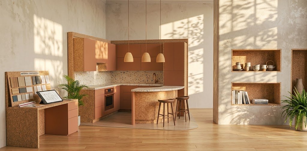
[…] are chosen, wall color is one of the easiest ways to tie the room together see our guide on what color to paint your kitchen. Countertop material should balance durability with maintenance, since some options require more […]